Brand Strategy
Why Some Brands Stay in Your Head
4 min read
Do logos make a company memorable? Or do we just assume they do because the companies we remember happen to have good ones?
It's worth thinking about.
Apple's logo is a bitten fruit. On its own, it tells you nothing about computers. Nike's is a simple tick. Nothing about shoes. If you saw either mark for the first time on a random product, it wouldn't mean anything to you.
So here's the question:
Did the logo make the company successful? Or did the company become so successful that the logo absorbed meaning over time?
I'm choosing the second.
Let's start with what's true. A product has to be good. No amount of clever positioning can rescue something terrible. That part isn't up for debate.
But being good isn't enough either.
Great products get ignored all the time. One of the major differences between those that grow and those that quietly disappear often comes down to one thing: whether they live rent-free in someone's mind.
That's not a design problem. It's a memory problem.
It's important to know this about memory. What a brand made them feel. What problem it solved, and when, is likely to stick with you.
You don't recommend a restaurant to a friend because you liked the font on the menu. You recommend it because of the meal experience.
Positioning.
It's the place a brand occupies in someone's mind, built through repeated experiences. Most of the time it's invisible until you compare brands side by side.
This matters more today than it did ten years ago, for one simple reason.
More content competes for your attention than at any other point in history. Every few seconds of scrolling is another war for your focus. In such environment, simply being pleasant is the baseline.
Distinctiveness increases the chances of being remembered.
Psychologists call this the Von Restorff effect: people are more likely to remember what stands out from its surroundings than what is objectively well-made.
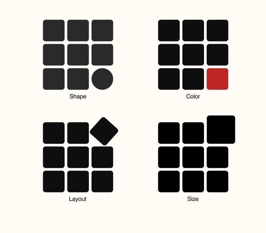
Put a beautifully designed logo in a row of ten other beautifully designed logos, and it disappears into the row. Put a slightly unexpected one in that same row, and it's the only one anyone can describe an hour later.
This is why, on most of our branding work, we push back against the obvious choice. The instinct is always to make the logo look like what the business does. A tooth for a dentist. A leaf for anything organic. It feels safe.
While these ideas may feel safe, they are predictable. When an idea feels obvious, chances are dozens of competitors have arrived at it too, making the brand unmemorable and unrecognizable.
So what do you do with this?
You stop treating positioning as a phase that happens before the design gets made, and start treating it as the thing the design is in service of.
This is not a tagline or a moodboard. It's a deliberate, consistent stance expressed through your messaging, how customers are treated, and what your visual system chooses to leave out as much as what it includes.
Done once, it's a nice idea. Done frequently, across every touchpoint, for years, it becomes something much harder to compete with.
You can also think of it as a moat. Your competitors can replicate your services and pricing. They cannot copy three years of consistently being the thing people think of first. That takes time to build and even more time to fake.
A great logo attached to a scattered brand is too expensive. A clear position, on the other hand, gives even a fairly decent logo meaning.
So this should tell you where the real work is.