Bloomforge
About Project
Bloomforge Ventures exports raw and natural shea butter to international markets.
The product and supply chain were already strong. What they needed was a brand that could compete on shelves in London or New York.
Export markets are visual first. Buyers decide in seconds, so the brand had to communicate quality, origin, and trust as quick as possible.
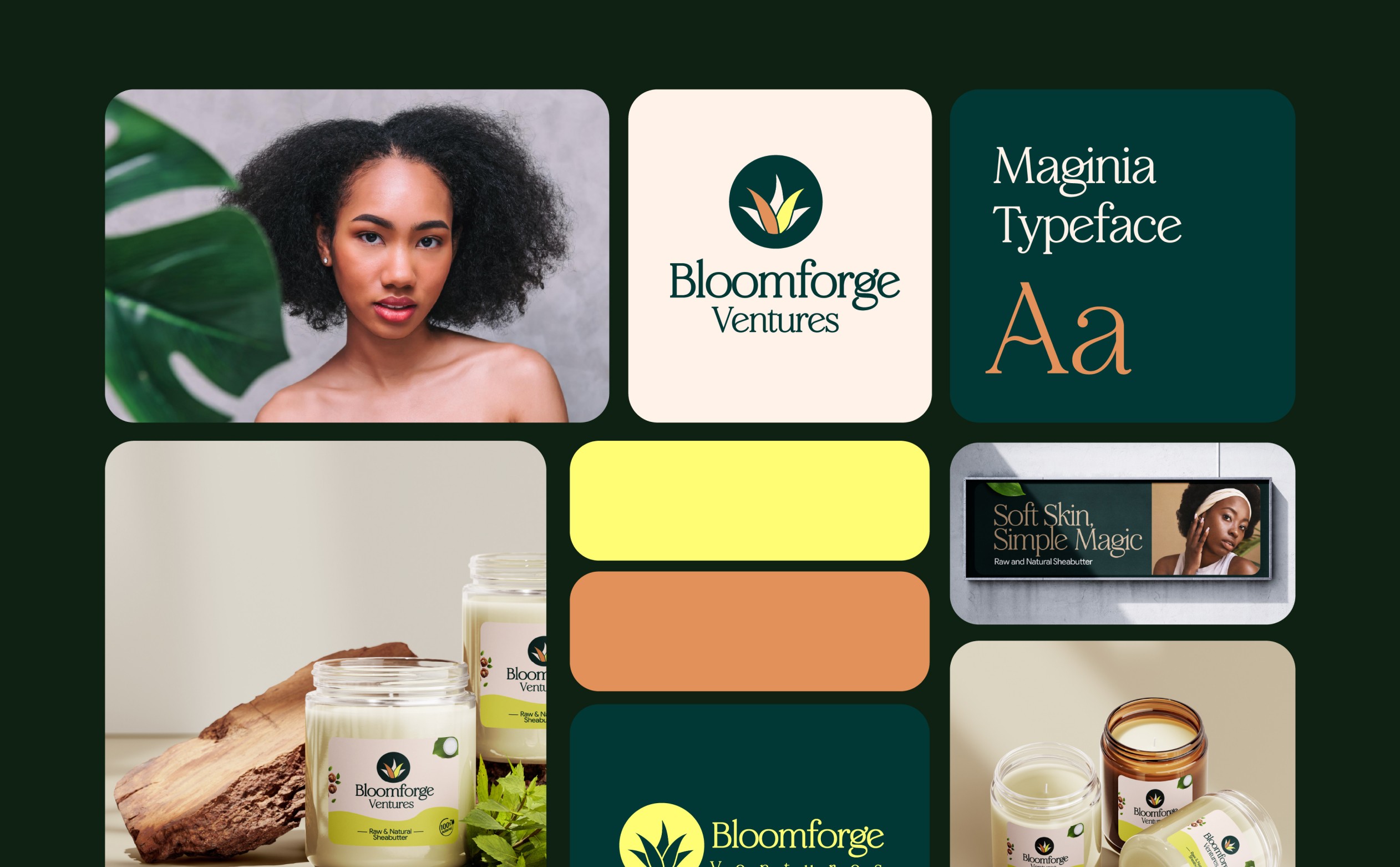
We created an identity that looked refined and premium.

Category
Logo, Packaging Design
Client
Bloomforge Ventures
The Problem
A great product entering a market that had never heard of it.
The global naturals market is crowded. Shea butter specifically has dozens of suppliers competing on the same claims "raw, pure, natural, organic." Most of them look similar. A new entrant with no shelf history and no brand recognition needs to give the buyer a reason to stop and pick it up. That reason is almost never the ingredient list. It's the label. The first impression the packaging creates before the product speaks for itself.
Standing out in a saturated international category
01
Communicating the Ghanaian provenance
02
Designing a premium visual system across different markets
03

Solution
We designed for the shelf
The identity was built around a mark that signals both nature and refinement, an aloe-form emblem set inside a circle, clean enough to work small, distinctive enough to own at scale. The colour system: deep forest green, warm cream, yellow-green, was chosen to feel natural without fading into the category noise. Maginia, the chosen typeface, carries the right weight: professional enough for export documentation, approachable enough for a consumer facing a product for the first time.